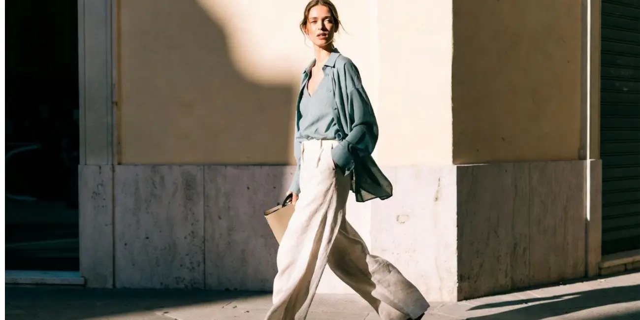
So here’s the thing about the old money look, it’s not just pearls and loafers and that whole “scarf over the shoulders” thing (though, yes, love that too). The real magic? It’s in the colors. Like, the way the tones are so soft and lowkey but still look super polished? Obsessed.

The old money color palette is full of quiet confidence, just hits differently. It’s subtle and soft. Kinda genius. These aren’t the loud, trend-chasing shades you see all over TikTok. They’re timeless. Think of neutral colors, nothing wild. And those muted tones that somehow make every outfit look ten times more expensive.
So let’s get into the go-to colors in the old money world, how to style them, and why they’re the backbone of every elegant, luxury color palette that feels a little more expensive without doing too much.
What Is the Old Money Color Palette?
So what actually counts as the old money color palette? Okay! Imagine standing in front of your closet, and thinking, “Ugh, why does everything feel kinda loud or just… not it?” We’ve all been there. Bright colors, weird prints, nothing feels easy to throw on, right? That’s when the old money color palette comes in to save the day.
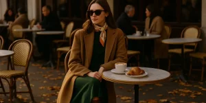
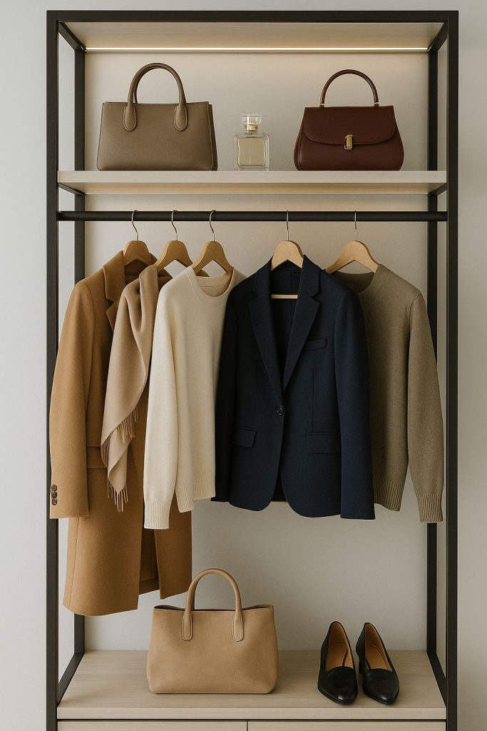
Start to think of these colors: cream, camel, navy, olive, charcoal, you know, the stuff that never screams but somehow always gives that old money look. Please, no hot pinks or neon greens here. Just colors that feel calm, classy, and like they belong in a fancy country house where someone’s always making tea.
These kind of tones are easy. Honestly? I was amazed at how they match with almost anything, they never go out of style, they age beautifully, and they make even a plain sweater look expensive. That’s the old money color scheme in a nutshell. It’s not about showing off, it’s about looking put-together without even trying.
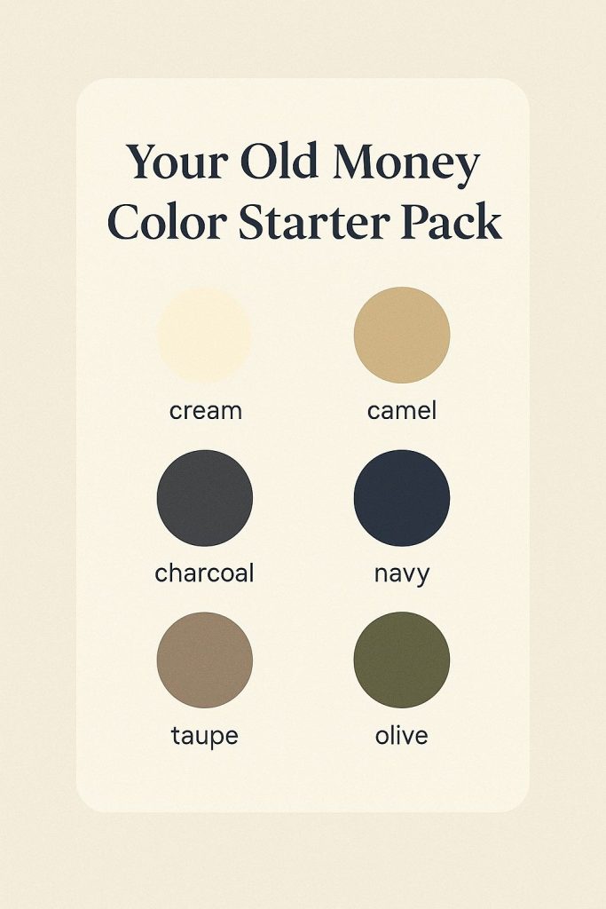
Your Old Money Color Starter Pack
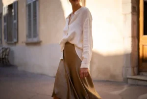
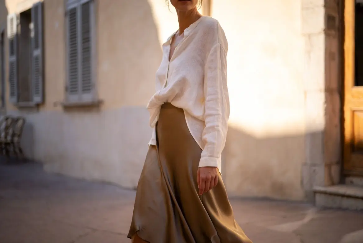
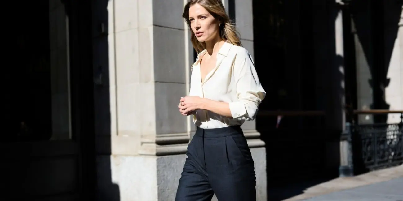
If you want that old money vibe, start with the basics, and by basics, we’re talking cream, ivory, camel, navy, charcoal, taupe, olive… the classic crew. These are the shades that just get it right every single time. You’ll actually see them in coats, sweaters, trousers, bags… honestly, they’re everywhere!
What do I love about these colors? They do the magic of tonal dressing, like they all mix very well, so you don’t have to overthink it. You can throw on a few shades of beige or grey and still look like you planned it.
If you want these colors to look good, the fabric makes a big difference. Neutrals just hit different when they’re in nice stuff like wool or linen, they’ve got that fine texture that makes everything feel a little more classy. I know, they might look kinda blah on the hanger, but once you layer them right? Game over.
Accent Colors: Just Enough to Keep It Interesting
Once you’ve organized your neutrals properly, adding a pop or two of accent color helps tie the whole thing up:
deep burgundy, forest green, powder blue, even a tinge of rust if you’re really feeling fancy.
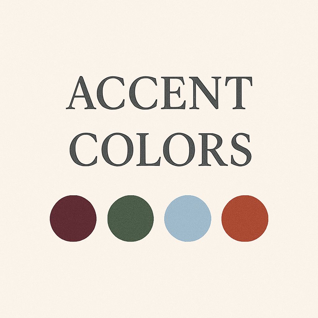
They’re pretty chill, none too loud, just those colors that add a bit of interest to you while keeping it classy. They’re part of that elegant color palette but with a bit more personality.
Actually, you don’t need much. Maybe it’s a forest green scarf thrown over your camel coat or burgundy loafers with a cream knit. Or the smallest things, like a powder blue cardigan or a rust bag, can finish off a look. Just keep it simple and lowkey and let these accents do their work. Just one pop at a time will work.
How to Combine These Colors Like Old Money
Putting these colors together is way easier than it sounds. Here are easy ideas:
1. Stick to one color family.
I swear by sticking to the same color family, like all cream, a mix of greys, or navy with a touch of camel. It’s simple, but looks super polished.
2. Mix textures, not colors.
This is the trick no one talks about. Try a wool coat over a cashmere sweater with leather boots, all in similar tones. It adds depth without doing too much!

3. Go for classic combos.
A few pairings that always work:
- Navy + camel
- Olive + cream
- Charcoal + beige
They’re lowkey, but you know, still feel intentional.
4. Don’t overthink it.
If your outfit feels a little busy, just take one off. Less is always more with old money look, keeping it clean and effortless.
How to Switch It Up Each Season: The Old Money Way
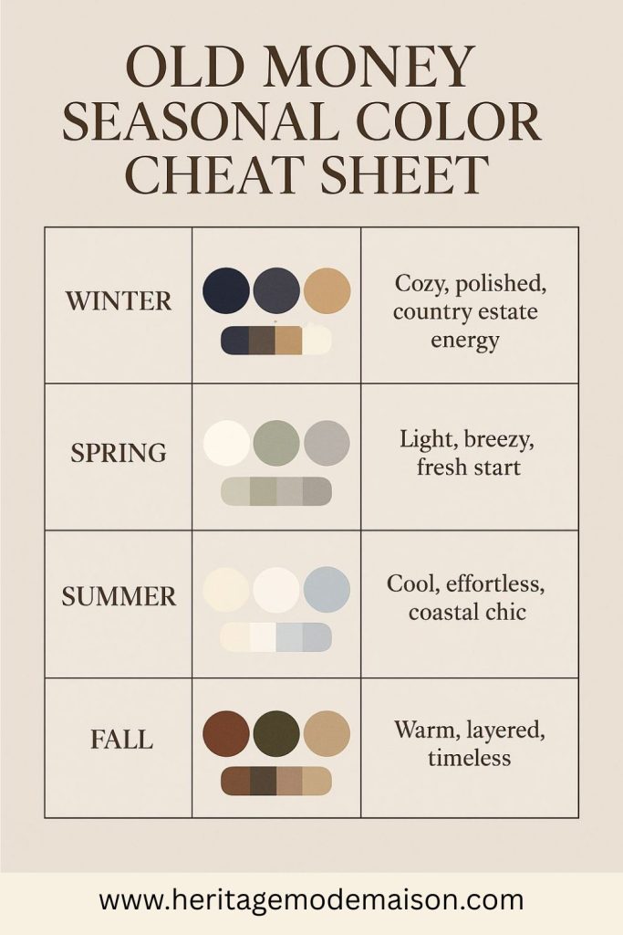
Your Old Money Seasonal Color Cheat Sheet
| Season | Colors | Mood |
| Winter | Navy, charcoal, camel, cream | Cozy, polished, country estate energy |
| Spring | Soft white, sage, dove gray | Light, breezy, fresh start |
| Summer | Linen, ivory, pale blue | Cool, effortless, coastal chic |
| Fall | Rust, forest green, brown, beige | Warm, layered, timeless |
Shopping Tips To Spot the Right Shades
Okay, quick tip: if the fabric feels cheap, the color probably will too. You know that moment when you’re staring at your closet thinking, “Why does everything feel… off?” Yeah. Been there.
So, stick with more natural materials like wool, linen, or cotton, they take color better, so the shades look richer and softer.
Skip anything that’s super shiny or feels plasticky, hard pass. And if you’re stuck between two shades? Go with the softer one or more muted. It’ll always look more expensive. Every time.
Build a Wardrobe You’ll Love Forever
At some point, you realize chasing trends is exhausting. It’s way better to have pieces you actually love year after year, a closet that just works, season after season. And color plays a huge part in getting started.
When you stick to those timeless, muted tones, everything just feels more pulled together (even if you got dressed in five minutes). The old money color palette isn’t one-size-fits-all. Play around with it. Find the shades that feel like you. Whether it’s a closet full of cream and camel or you love adding a little forest green here and there, it all works.
Pin your go-to shades or drop your fave old money color combos in the comments. We’re all about the inspo!