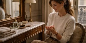
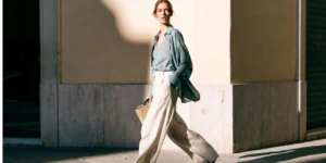
I was flipping through a stack of old wedding albums recently. Thick paper pages. Softly faded photographs. And something stood out immediately. The weddings that aged best were not the ones chasing what was popular at the time. They were the ones that felt calm from the start.
That is why choosing 2026 wedding colors feels less about predicting trends and more about trusting taste. Especially if you are drawn to a classic old money inspired aesthetic. These palettes are not trying to look new. They are trying to look right.
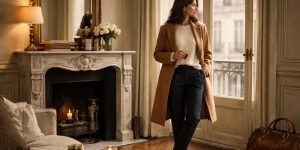
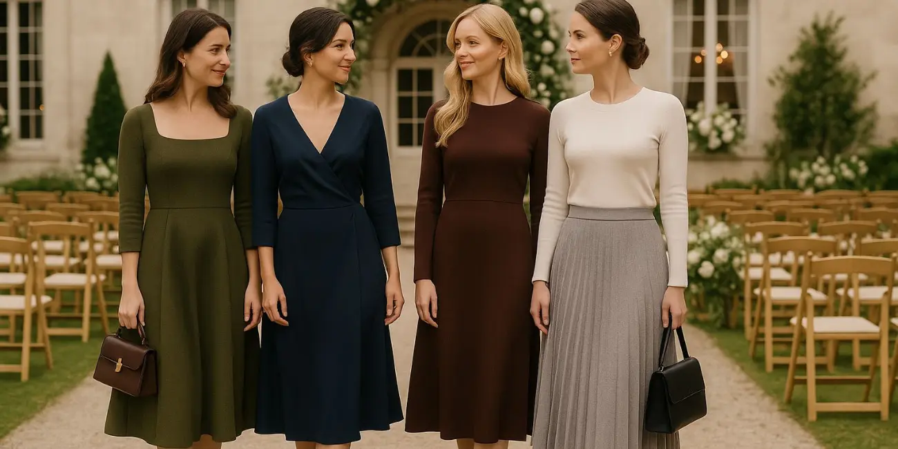
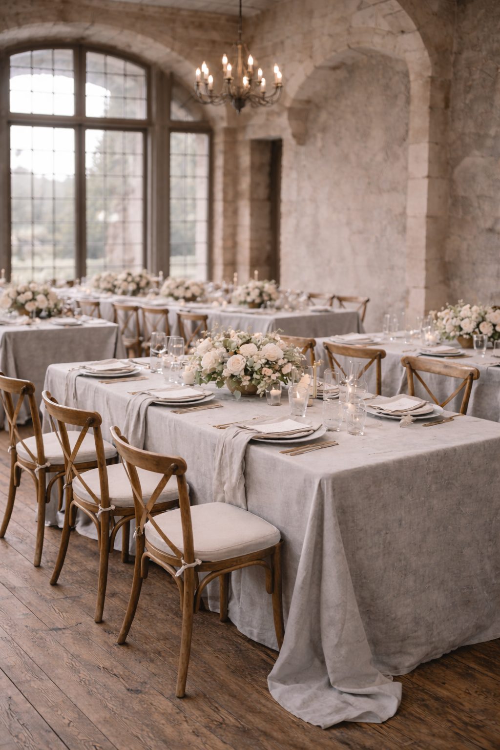
The most elegant weddings in 2026 will lean into colors that feel grounded, familiar, and quietly confident. You would expect to see these colors in old homes, estate settings, churches, or softly lit rooms. Even years later, they hold up when you look back at the photos.
Below are twelve wedding colors that fit beautifully into that world.

What makes a wedding color feel timeless
Timeless wedding colors have depth. They are rarely flat or overly saturated. They soften under natural light and warm up under candlelight.
They also work with real materials. Linen tablecloths. Stone floors. Wood beams. Silk dresses. Wool suits. These colors do not need styling tricks or heavy decoration to feel complete.
Now, the good part.
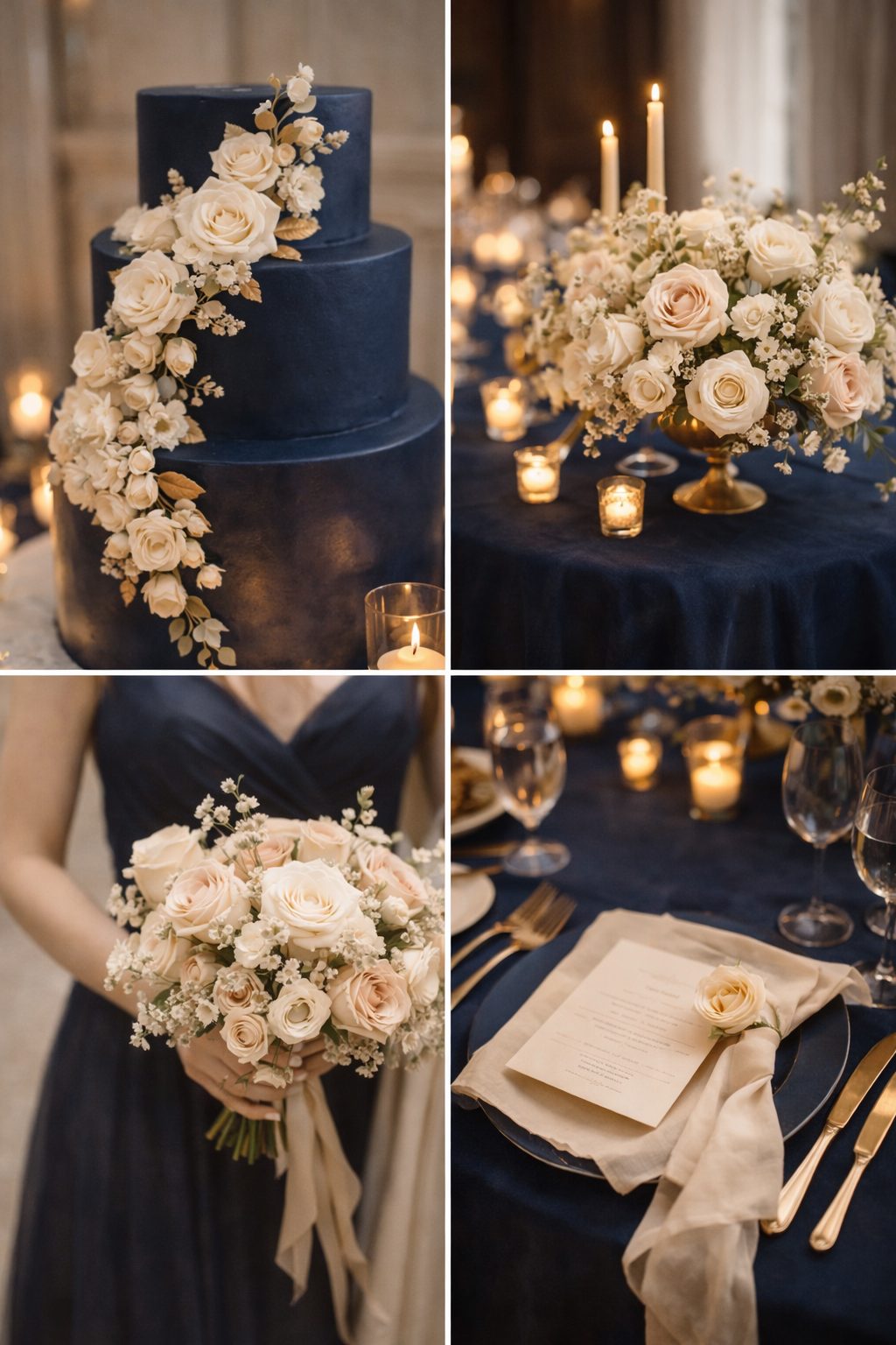
1. Creamy ivory
Ivory is still the quiet hero of 2026 wedding colors. Not stark white. Not yellow cream. The kind that looks soft in daylight and warm by candlelight.
Ivory gives the rest of the space a bit of breathing room. Linen on the tables, porcelain place settings, simple florals. It all feels considered without feeling worked on.
You notice it most in indoor venues with lived-in wood floors, or in outdoor ceremonies where nature does the heavy lifting and the colors simply fall into place.

2. Soft champagne
Champagne is having a subtle return, but in a much more refined way. Think muted gold rather than sparkle. Worn-in brass rather than sequins.
It tends to show up in the details rather than the main event. Think glassware, subtle table accents, or paper goods. Paired with ivory and warm neutrals, it adds warmth without trying to shine.
For weddings that lean elegant without being overly delicate, champagne just makes sense.

3. Deep navy
Navy is one of those colors that never really leaves. It just waits patiently until people remember how good it looks.
You see navy working best in evening weddings, coastal settings, or formal indoor venues in 2026. It holds the space together and gives contrast without feeling loud.
With ivory, cream, or soft gold nearby, navy feels calm and grounded. It does not ask for attention or explanation. It just sits there, doing its job beautifully.
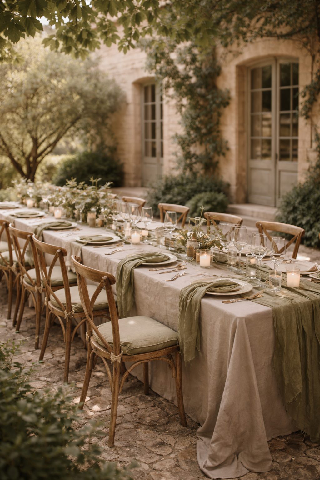
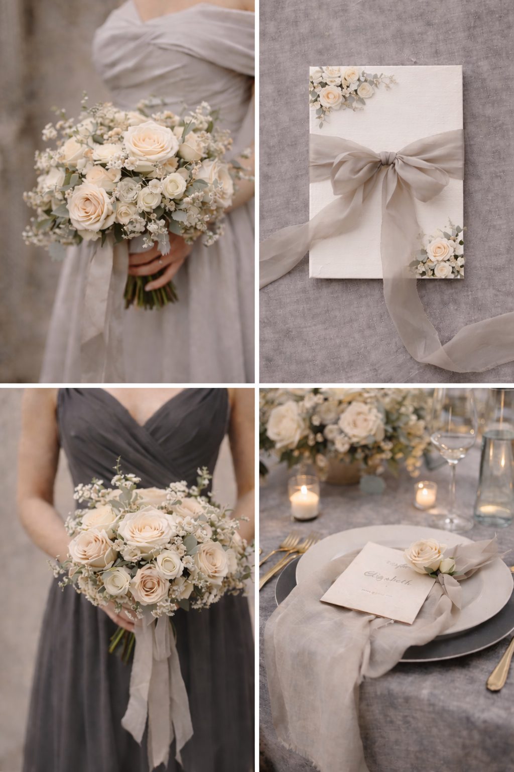
4. Warm taupe
You might pass over taupe at first, but it starts to feel obvious once you notice it. Resting between beige and grey, it brings a warmth that feels steady and architectural rather than dressed up.
You tend to notice this color in table linens, bridesmaid dresses, or softer floral choices. It sits especially well in stone venues, European-style estates, and spaces that already lean neutral.
Taupe is also incredibly forgiving in photos, which is a small detail you will appreciate later.

5. Olive green
Olive green continues to feel right for 2026 weddings, particularly when nature and tradition are part of the story. It does not call attention to itself. It simply fits.
This is not bright botanical green. It is muted. Earthy. The kind of green you see in well-loved libraries, countryside kitchens, and old leather-bound books.
Olive feels most comfortable next to ivory, taupe, and softer browns. Nothing feels arranged or forced, and because it works year-round, it suits outdoor weddings and those in-between months easily.
6. Chocolate brown
Brown has been creeping back into wedding palettes, and it feels long overdue.
Chocolate brown feels rich and grounding when used intentionally. Think ribbon details, wood accents, leather touches, or subtle textile layers.
Paired with cream or champagne, brown adds warmth without heaviness. It feels especially appropriate for fall weddings or venues with historic character.

7. Dusty blue
Somewhere between navy and pastel sits dusty blue. It has shape and depth without feeling heavy, and a calm quality that feels familiar rather than trendy.
You see it work best at daytime weddings, especially in spring or early summer settings. Paired with ivory florals and gentle greenery, it feels natural rather than planned.
Dusty blue has a way of feeling known, like a color you trust instinctively.

8. Soft blush
Blush is still around, but in 2026 it is grown up. No bubblegum tones. No overly sweet pinks.
The right blush feels like a whisper. Warm, muted, and natural. It works beautifully in florals, stationery, or small accent details.
With taupe, ivory, or champagne around it, blush feels warm and romantic without tipping into anything too youthful.

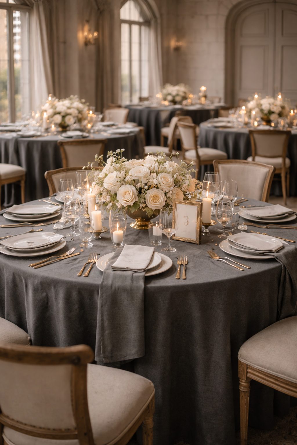
9. Charcoal grey
Charcoal has the depth of black but with more softness to it. It feels warmer and less demanding.
It works especially well for formal evening weddings or modern classic venues where black might feel too sharp. With ivory, champagne, or muted metallics, charcoal settles in easily.
For couples caught between navy and black, charcoal often ends up feeling just right.
10. Muted gold
Gold never really leaves weddings, but muted gold is where 2026 wedding colors truly shine.
This is brushed brass. Antique frames. Soft metallic threads woven into fabric. It adds depth without sparkle overload.
Gold works best in small doses, bringing warmth and refinement without feeling dominant.

11. Stone grey
Stone grey feels lighter and easier than charcoal. There is warmth to it, but it still looks clean and structured.
You see it work best in modern classic venues, especially those with stone floors or concrete elements. Paired with ivory, taupe, and soft greenery, it feels considered without standing out.
It is a color that suits couples who value understatement over impact.
12. Antique blue-green
Antique blue-green falls somewhere between blue and green, with a softness that feels gently aged. It recalls old ceramics, well-loved book covers, or weathered shutters on European homes.
Antique blue-green is at its best when used sparingly. In linens, glassware, or stationery, it adds character without pulling attention away from the overall palette.
It feels collected rather than styled.

How to mix these colors without overthinking it
The most successful palettes usually follow a simple formula:
- One anchor color.
- One soft neutral.
- One accent.
For example, navy with ivory and muted gold. Olive with taupe and cream. Stone grey with blush and champagne.
Keeping the palette tight lets the textures do the work. Linen, silk, wood, and florals start to matter more when color is not competing for attention.
Choosing colors that work with real venues
People often decide on 2026 wedding colors before really looking at the venue. But the wood tones, ceiling height, stone walls, and natural light all shape how those colors will actually look.
A palette that feels perfect on paper can feel off if it fights the space. The most elegant weddings feel like they belong exactly where they are.
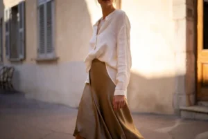
If you already gravitate toward a refined old money color in your everyday style, you already have a sense of which colors feel right to you. That tends to carry over more naturally than you expect.